08/02/2011
Less is more
As I said in my last Neutrogena post, and like Kelly says on her blog, I covet simplicity in design ... and advertising!
 Thanks to an old GQ issue (Yes, girls read GQ too!) I discovered the art works of graphic designer Albert Exergian, illustrating TV series. (Like Miami Vice here)
(And many other blogggers have commented them!)
Simple, evident, streamlined, ... just brilliant !
(though some imply a real good knowledge of the program to understand the references and humour..)
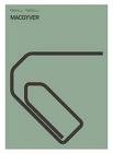
Enjoy some here, about Mac Gyver, Sex and the City, Prison Break or Star Trek..


And more there on his website or his... printer. (yes! you can buy them!)
My personal favorite is this one (but you need to make it bigger.. :) )
What else ?
He even did it for songs ! (see here)
well done!
23:12 Publié dans Design & Co | Lien permanent | Commentaires (0) | Tags : graphic design, advertising, albert exergian |  |
| ![]() Facebook
Facebook


